pyobsmod plots#
If you don’t necessarily want to work with a class instance, then you can
use the pyobsmod.plots module to plot your data directly. Here are some
examples. All of the examples provided here work also with the
pyobsmod.Dataset class directly, try it out!
First, import required packages.
import matplotlib.pyplot as plt
import numpy as np
import pyobsmod.plots as pp

from pyobsmod import load_dataset_example
Load some example data.
ds = load_dataset_example()
obs = ds.obs
mod = ds.mod
time = ds.df.index
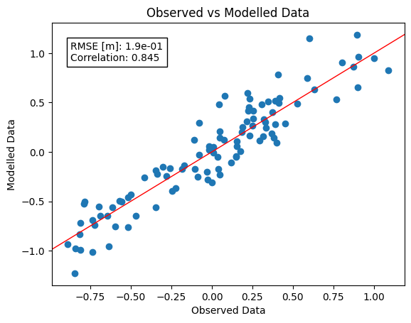
Let’s take a look at the different plotting options. The first one is a
simple scatter plot with the reference line already plotted for you. If
needed, you can also add some additional statistics, by passing a list of
valid names to the which_stats argument.
ax = pp.scatter_plot(obs, mod, which_stats=["rmse", "r2"])
plt.show()

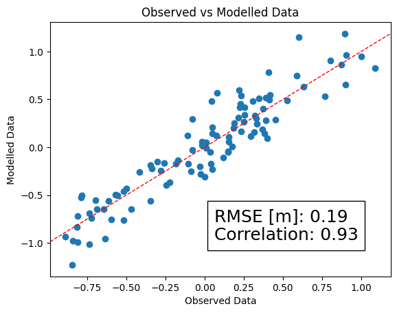
You can also give alternative names to the statistical quantities. Just pass
names as well. Make sure that they are in the same order. By the way,
you can also pass an alternative formatting string if the default does not work
for you.
ax = pp.scatter_plot(
    obs,
    mod,
    which_stats=["rmse", "r2"],
    names=["RMSE [m]", "Correlation"],
    fmt=[".1e", ".3f"]
)
If you want to modify the identity line or the textbox you can pass all the typical matplotlib keywords to the function in the form of a dictionary. For example for a dashed identity line and a larger fontsize of the textbox that we want to put in the right bottom corner of the plot:
ax = pp.scatter_plot(
    obs,
    mod,
    ["rmse", "r"],
    names=["RMSE [m]", "Correlation"],
    idline_kws=dict(ls="--"),
    textbox_kws=dict(loc="lower right",
    prop=dict(size=18)),
)
plt.show()
Continuing like this, you can refine your plot as you please.
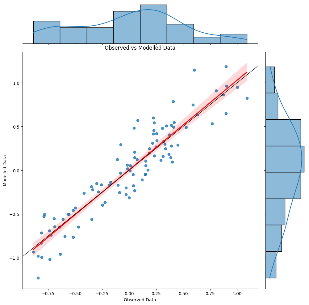
There is another scatter plot function, which is very similar, but uses
seaborn’s seaborn.jointplot as a basis. This gives you marginal plots
and a regression estimate (with standard deviations) in addition to the
identity line and the scatter plot of your data set. As before you can tweak
the plot as you like by passing keyword dictionaries, for this take a look
at the seaborn web page. Here is the simplest example:
grid = pp.scatter_plot_sns(obs, mod)
plt.show()
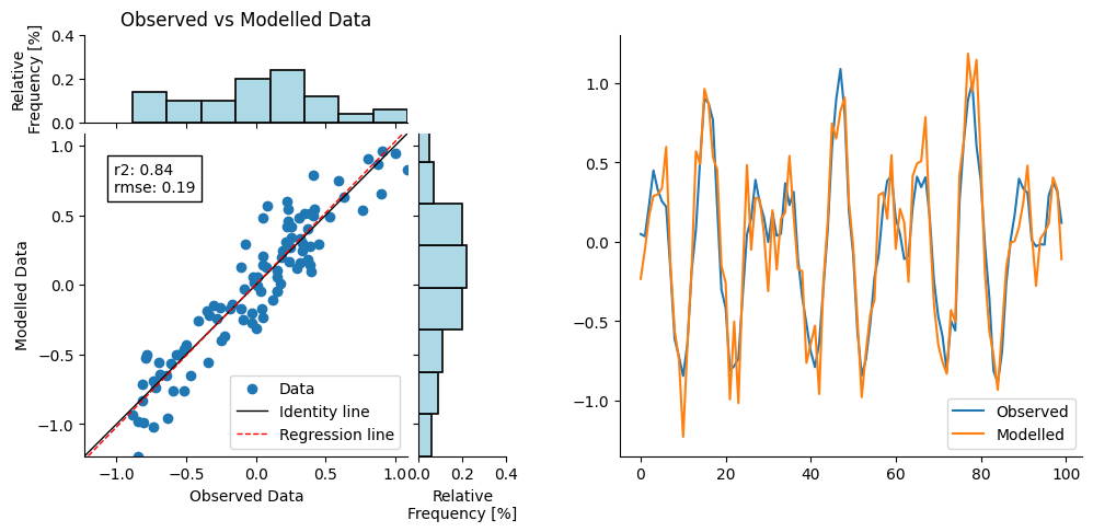
Unfortunately, since seaborn.jointplot creates its own figure instance, it is
not possible to use the results as a subplot. For this, a less elaborated, but
more flexible function is provided with pyobsmod.plots.scatter_plot_joint.
It still gives you marginal plots and a regression estimate, but without the
standard deviations. To use it in a subplot, you can pass the axis to the function
as usual:
fig, axs = plt.subplots(1, 2, figsize=(12, 5))

axs_joint = pp.scatter_plot_joint(obs, mod, ["r2", "rmse"], ax=axs[0])
axs_joint[0].legend(loc="lower right")

axs[1].plot(obs, label="Observed")
axs[1].plot(mod, label="Modelled")

axs[1].legend(loc="lower right")

plt.show()
If you are interested in the evolution of your time series over time, you
can use the pyobsmod.plots.time_series_plot function. As before you
can compute and plot some statistical quantities along with it and if you
want you can also pass a time array, which will be used as the x-axis.
ax = pp.time_series_plot(obs, mod, time)
plt.show()

You can also use these plots as subplots in a larger figure. You simply can pass the axis to the function, for more information scroll through the pyobsmod Dataset tutorial.
Take a look at our API documentation to dig deeper and look at the matplotlib and seaborn documentations to find out more about the keywords to tune your plots accordingly!